Main Features
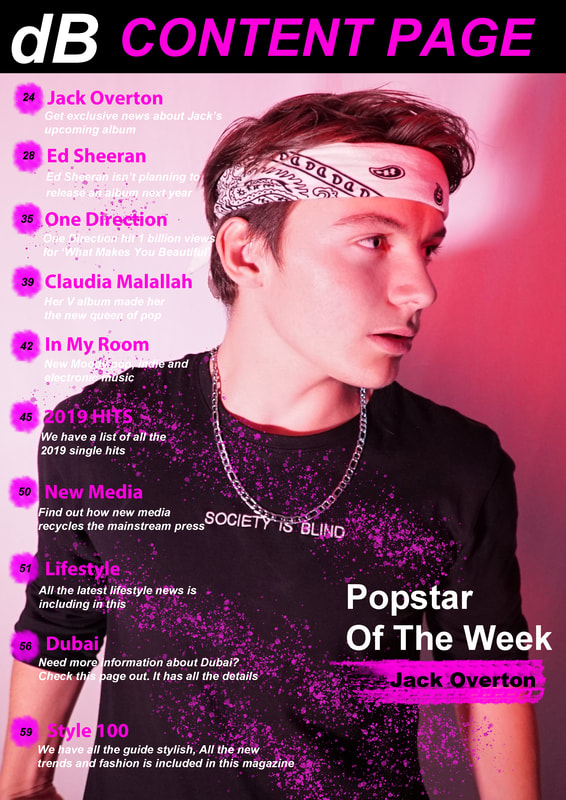
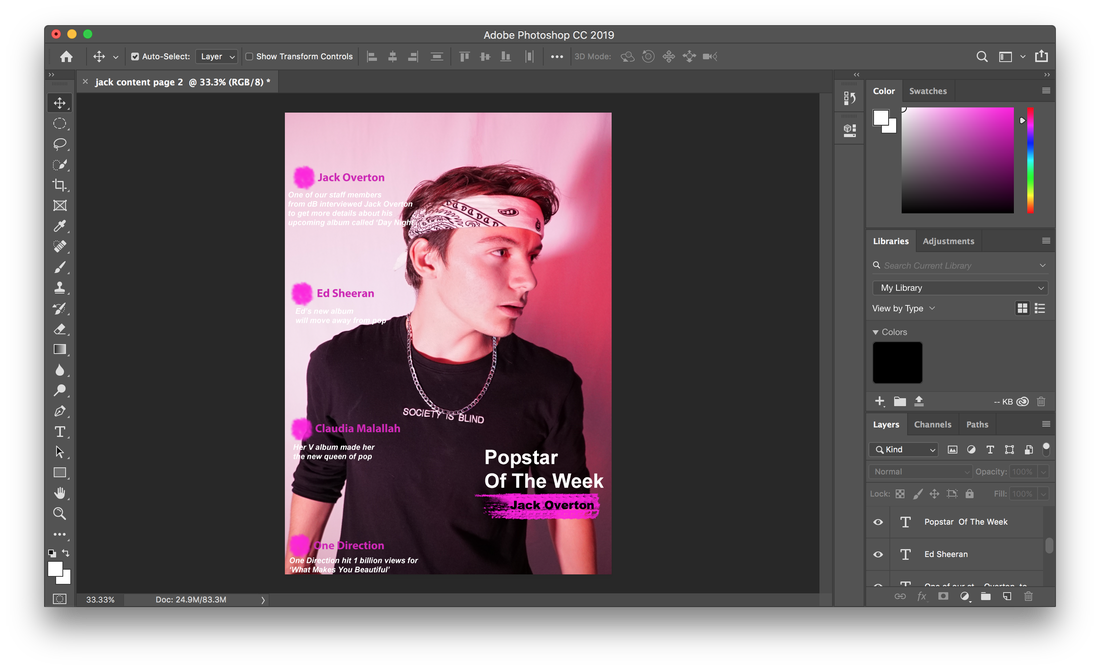
Jack Overton: Get exclusive news about Jack’s upcoming album
Ed Sheeran: Ed Sheeran isn’t planning to release an album next year
One Direction: One Direction hit 1 billion views for ‘What Makes You Beautiful’
Claudia Malallah: Her V album made her the new queen of pop
In My Room: New Moody pop, indie and electronic music
2019 HITS: We have a list of all the 2019 single hits
New Media: Find out how new media recycles the mainstream press
Lifestyle: All the latest lifestyle news is including in this
Dubai: Need more information about Dubai? Check this page out. It has all the details
Style 100: We have all the guide stylish, All the new trends and fashion is included in this magazine
Colour scheme
Pink – connotes love, feminism and romance
Black – connotes power and wealth
White – my background for the title is black so, my title’s colour will be white so it stands out with the colour black.
All the colours remain the same as my front cover.
Black – connotes power and wealth
White – my background for the title is black so, my title’s colour will be white so it stands out with the colour black.
All the colours remain the same as my front cover.
photography
Model:
Jack Overton
Jack Overton
step by step production
|
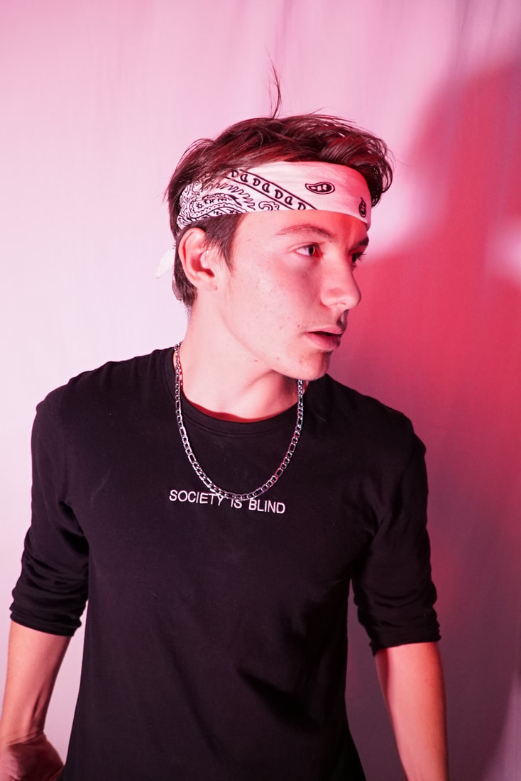
step 1:My first step was to pick the picture that I wanted use for my content page. I chose this one because the model's facial expression is appealing to the target audience. I wanted the model to look casual in the picture and this one works the best in my opinion. Also when I add the text I don't want the text to cover his face so having the model looking towards the right it makes it easier for me to add text on the left and the model's face does not get covered by texts. Also the lighting is perfect in this picture, I wanted bright pink lighting on the model even though my model is a male for the content page I still want to support feminism in this magazine because my main model is a female for this whole magazine. Also in the other pictures the pink colour is not as bright as this one. The reason why I chose this as my main image for the content page instead of the others because some of them were too cheesy and one of the picture the model looked like a rebel and that's not what I'm going for he's meant to look like a casual good looking teenager and this picture is very appealing to the target audience. For the mode of address I had the modeler looking away from the camera because this to make him look like he is so important that he has other things to focus on and this also makes the reader wonder what is he looking at. I made the modeller pose straight but then made him look towards the right because when I add the text to the left I don't want them to cover his face. The reason why I chose Jack as my modeller for my content page is because he has the perfect looks for a modern pop star and his dress style and everything is a perfect example for a pop star. I made him wear a black shirt because it blends well with the background and he stands out more with that colour. I made him wear a bandana which makes him look more like a pop star and I had him style his hair to the side because it appeals to the target audience.
|
Step 2
|
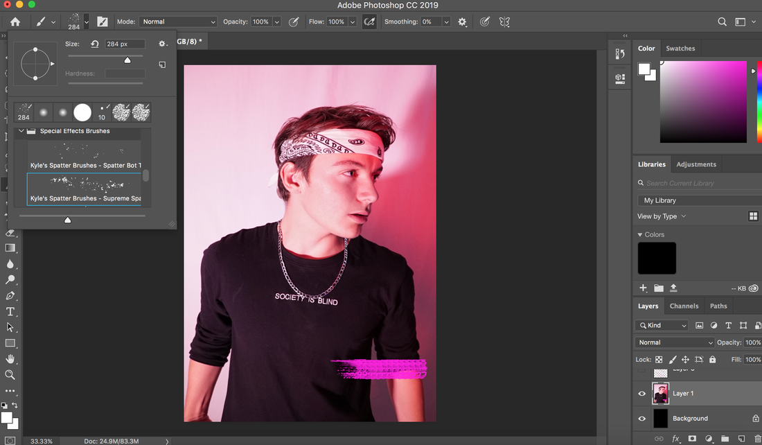
For step 2, I used the paint brush to paint the pink overlay on the bottom right of the picture so I can put the artists name on it in black and the text disappears if that pink painting isn't there because of the model's shirt the text is not visible so I painted pink behind the artist name so that the name is visible also the text stands out in pink.
Before
|
After
|
step 3
|
For the next step, Instead of putting normal bullet points, I decided I will use the paint brush to create the bullet points and it stands out more. So I used the paint brush tool and looked for the right brush style to paint the circle and I painted all of them in pink because since my color theme is pink I decided to use pink, After that I added all of my text.
|
|
STEP 4
|
I used the spot healing brush tool to get rid of pimples or any spots that were on the model's face because in todays society no one accepts imperfection. Also there was one loose strand on the model's hair, so I got rid of that as well by using the spot healing brush tool.
Before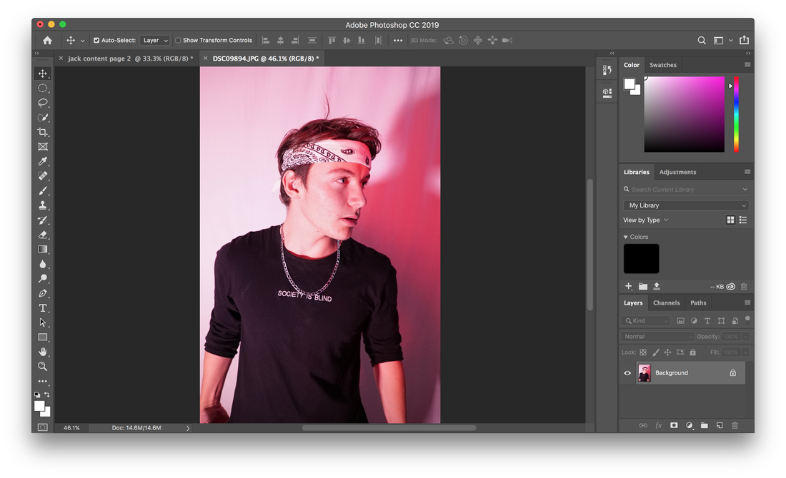
|

After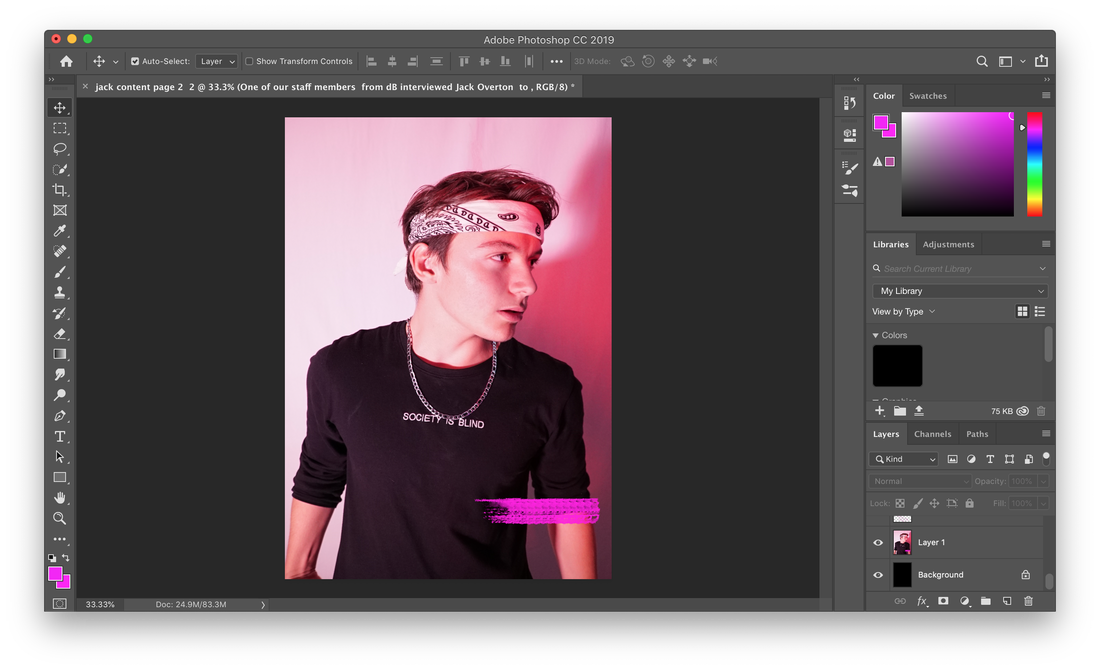
|
step 5
|
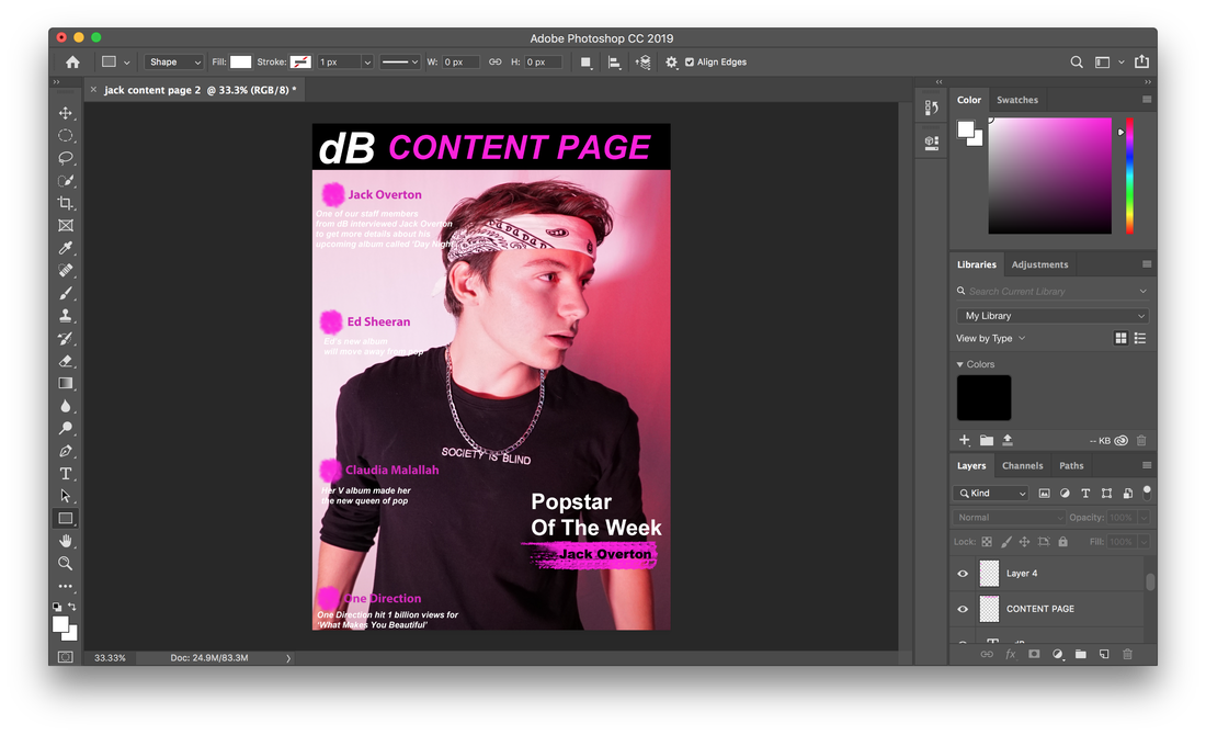
For step 5, I added a black bar, because that helps the title stand out more. I used the fonts that are provided in photoshop. Then I kept trying out different colors for the content page title and I went for a very strong pink colour because that stands out really well in black.
|
|
Step 6
|
I wanted to splash pink colour on the content page so that the content page stands out more, I used Kyle's Spatter Brush, and painted everywhere on the cover in pink. I felt the pink paint on the magazine cover helps to give that pink vibe out more Also I used a less bright pink color otherwise the paint blends with the text and no one will be able to read the text.
before
|

after
|
New Analysis of content page